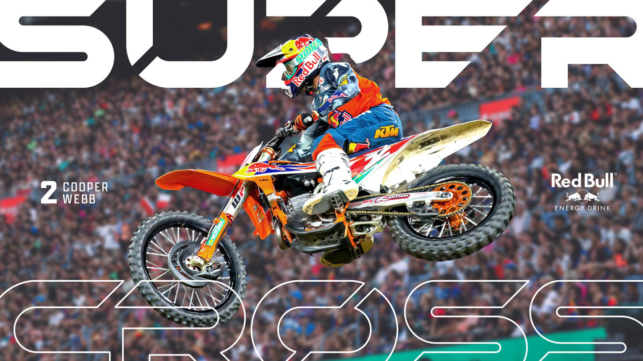
New era, same adrenaline. Supercross is revamped with a high-flying new typeface, badge and logo system.
Client: FELD Entertainment
Sector: Live Sports Events
Discipline: Brand Identity
Creative Direction: Dane Storrusten
Design Contributors: FELD Design Studio
Hierarchy matters.
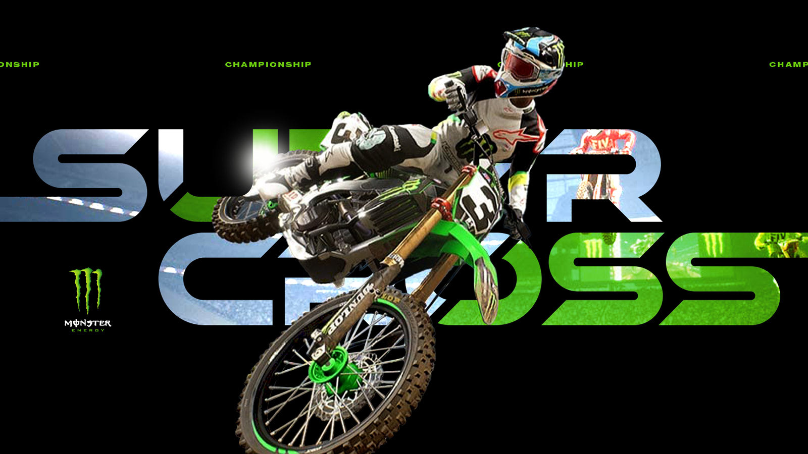
The Supercross event has a complex hierarchy of elements to consider including a title sponsor, AMA association, and a "Championship" modifier that evolves and changes. Our approach was to make these elements as intentional as possible.
Digging for truth.
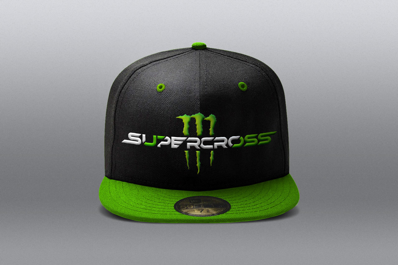
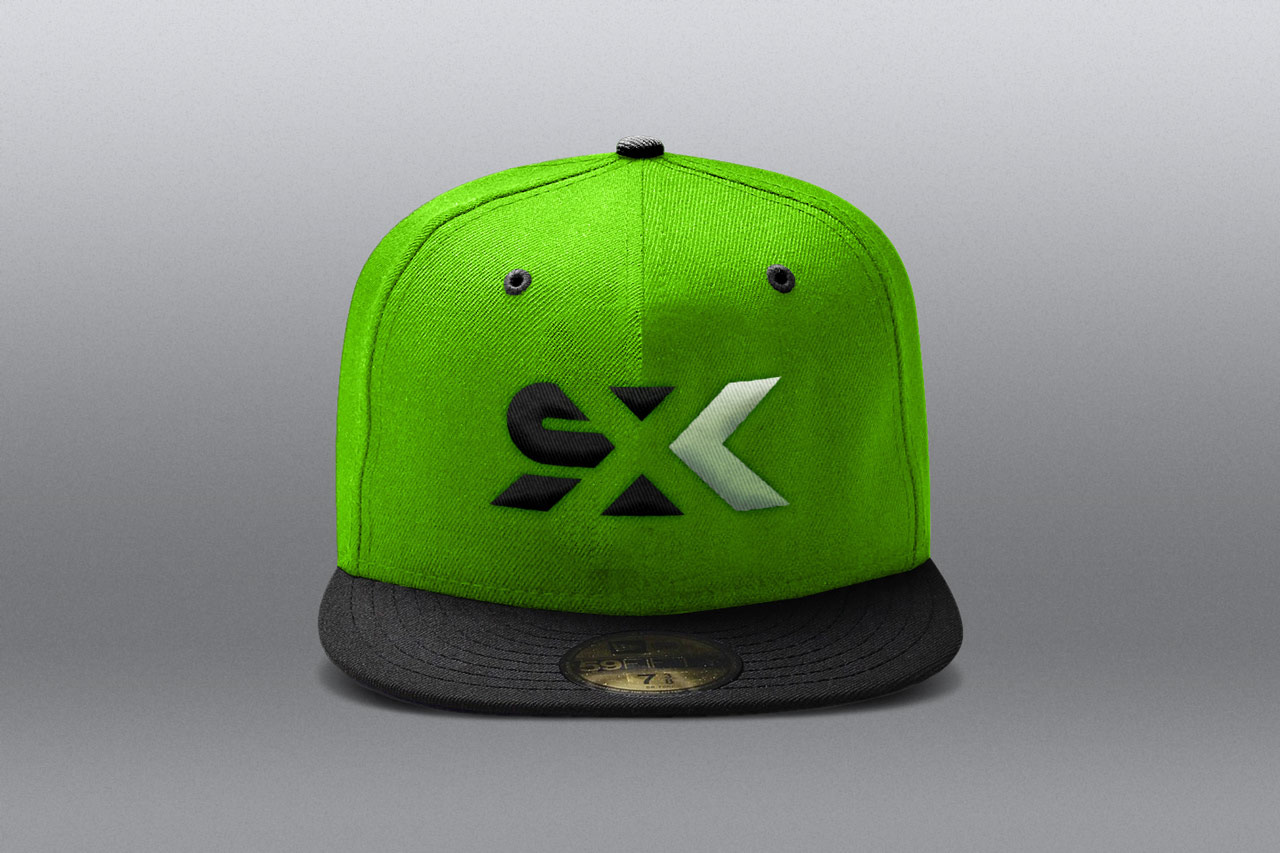
The true test of a successful sports brand of any kind: would fans and athletes (riders) where it on a shirt or hat? With Supercross, we left no rock unturned.
50+ design explorations from retro-to-underground-to-futuristic. The process started by looking within the action sports industry–finding brands that exemplify the culture of fearless, hyper-fueled, high-flying athletes that hang their hat on loyalty.
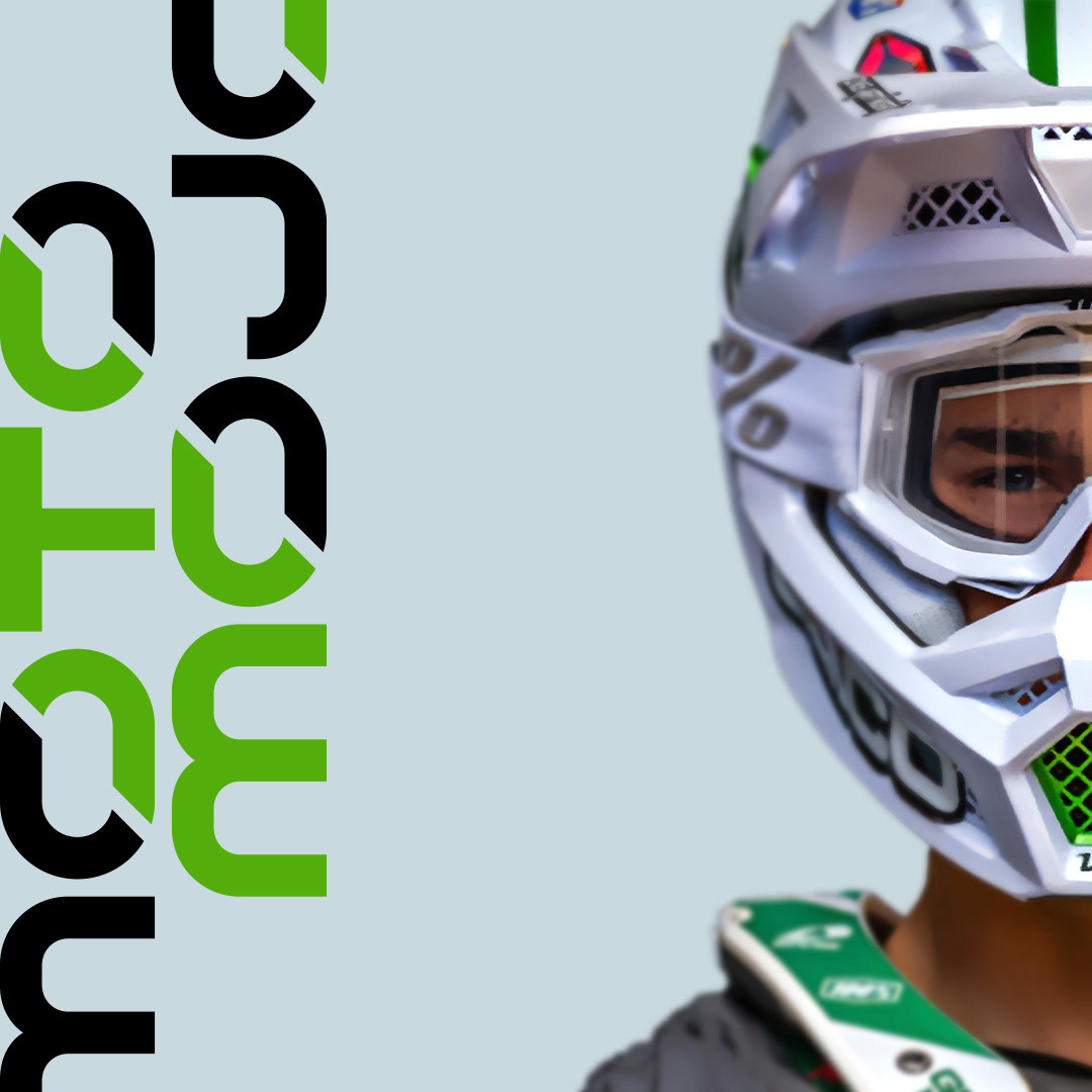
Motocross or Mojocross?
A bulletproof logotype that can live just about anywhere, but retain it's appeal.
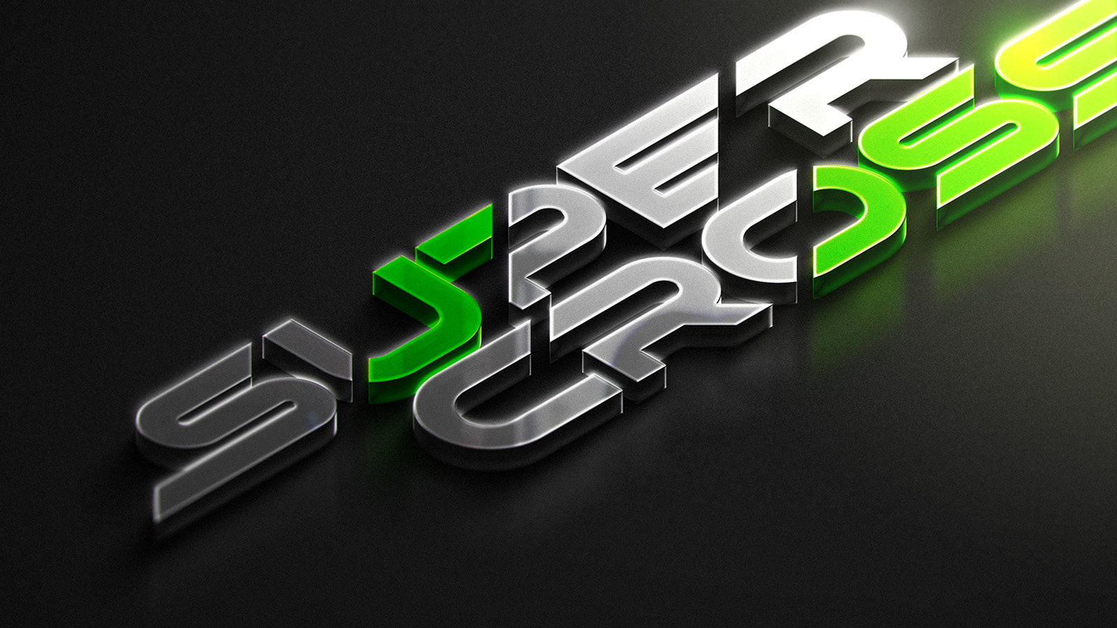
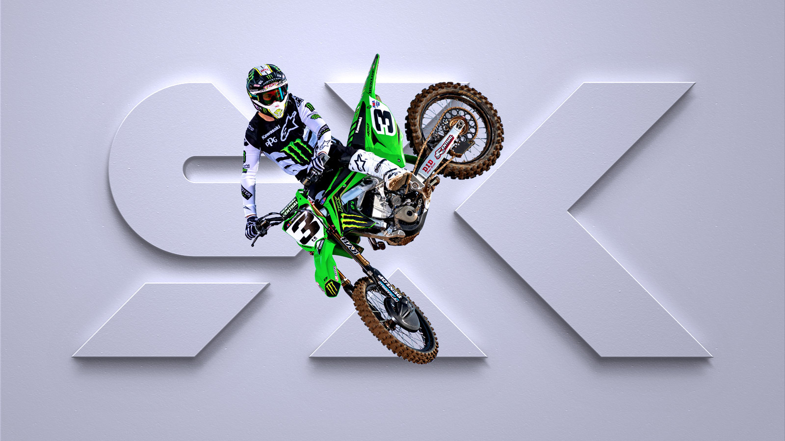
We developed a strong logotype that can live as a primary, secondary and even tertiary element in an environment of a powerful title sponsorship. It began with a hand-crafted typeface is built for pure performance–rooted in geometry and precision so it can live in any environment at any scale. Along with it, a minimalist monogram mark that shares the same DNA as its counterparts.
The Event Badge
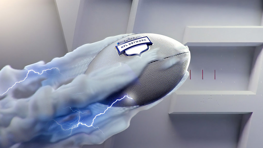
We designed and crafted a bulletproof device to hold all associative elements together in one intentional system including title sponsorship, event name, modifier, governing body and venue.
