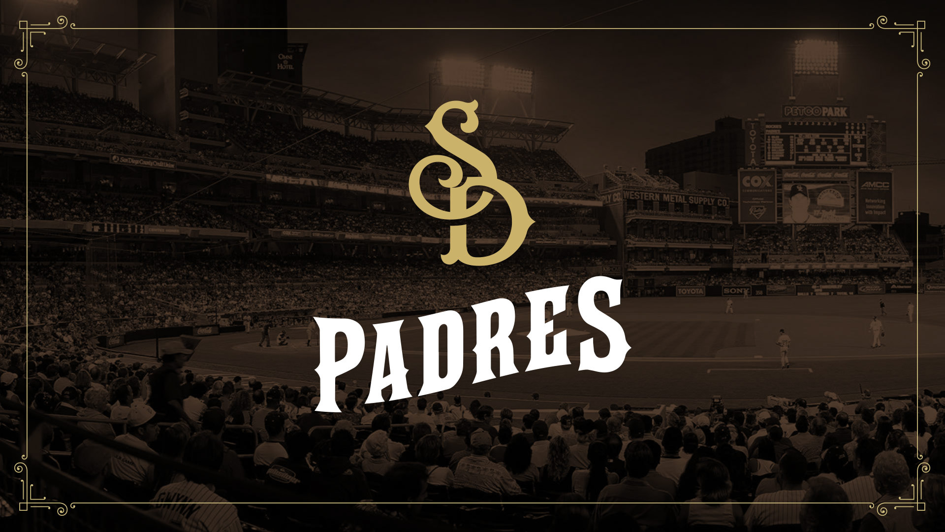
Bringing the soul back to San Diego with a touch of legacy, and a whole lot of flavor.
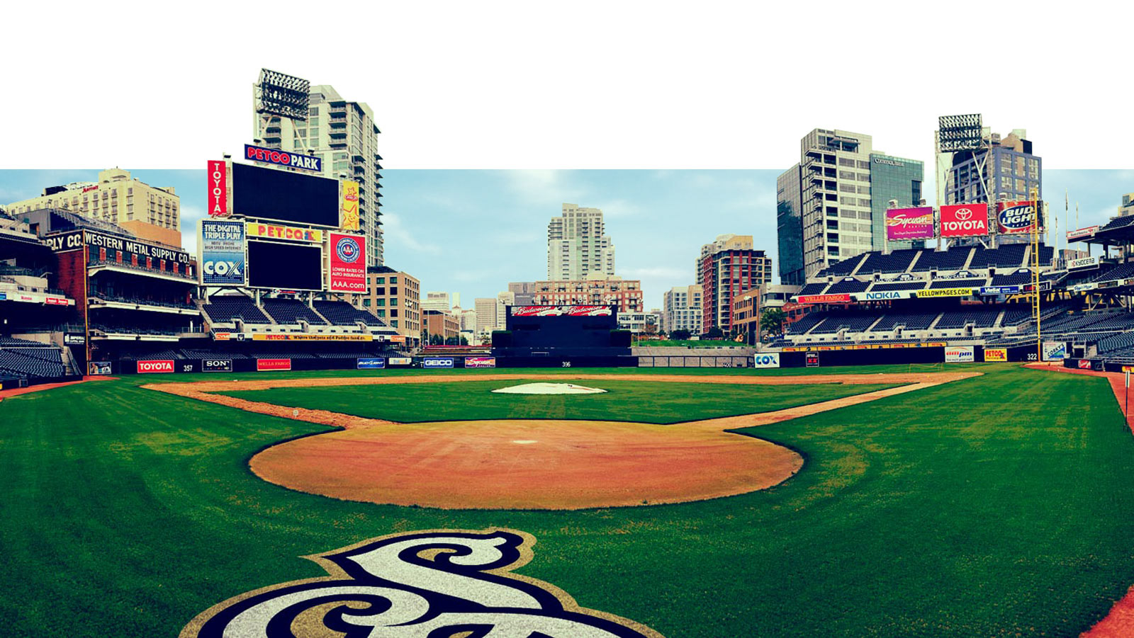
Client: San Diego Padres
Sector: Sports
Discipline: Brand Identity
Creative Direction: Dane Storrusten
Art Direction / Design: Dane Storrusten
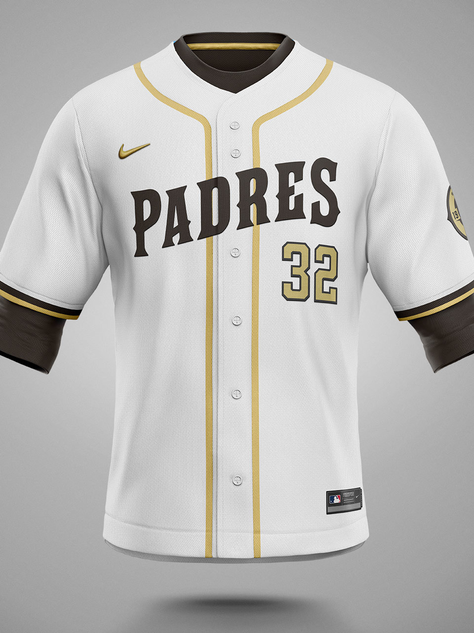
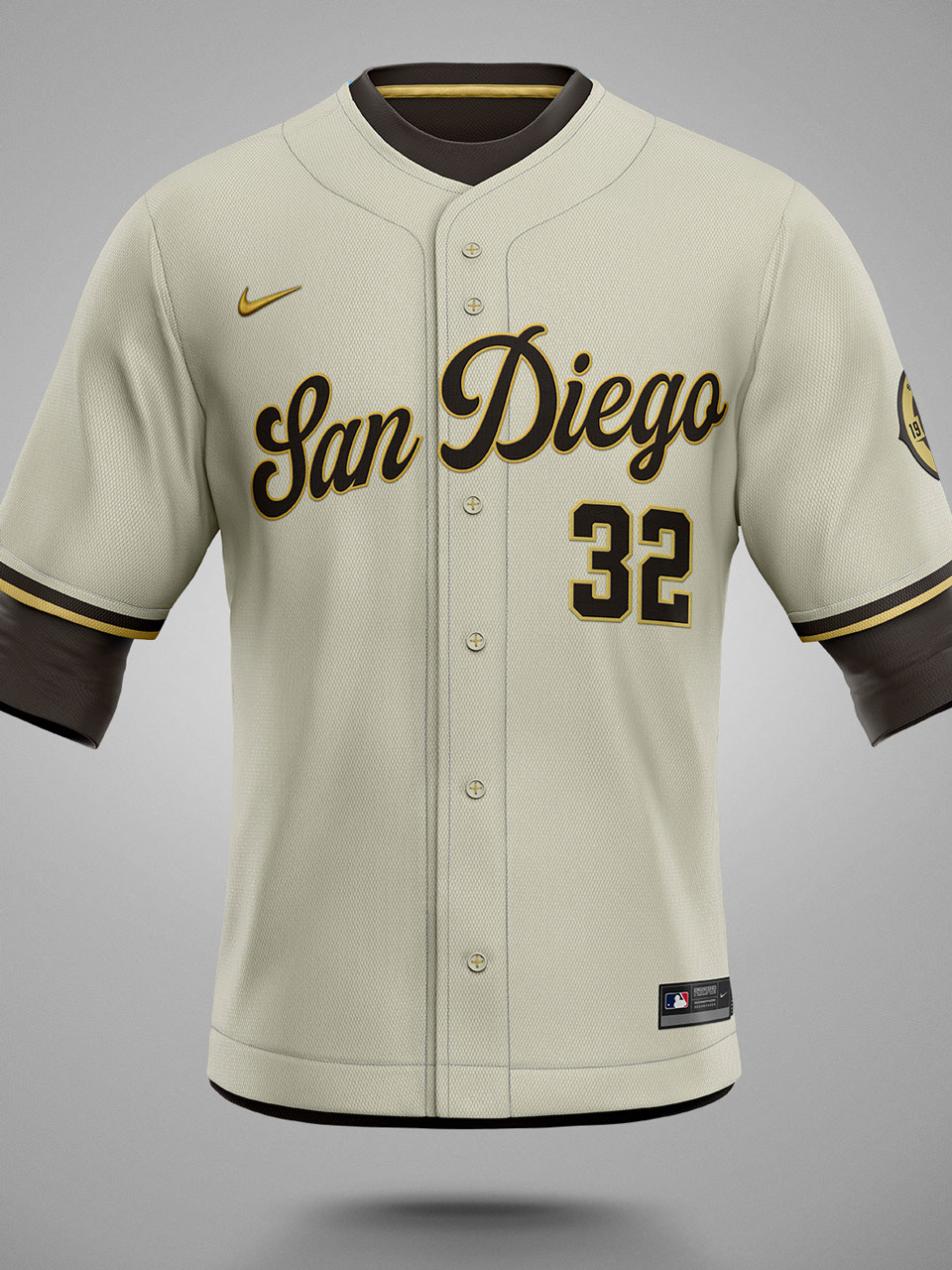
Uniform Design: Nike
Media Design Contributors: San Diego Padres Creative

History
The Padres have been through 3 distinct eras of branding, with some slight variation connecting each.
The Padres have historically had one of the more unique color palettes in MLB through the 70's, 80's and 90's. Then an abrupt diversion to a more sterile, corporate approach in hopes of gaining integrity. The result has been, well, soulless.
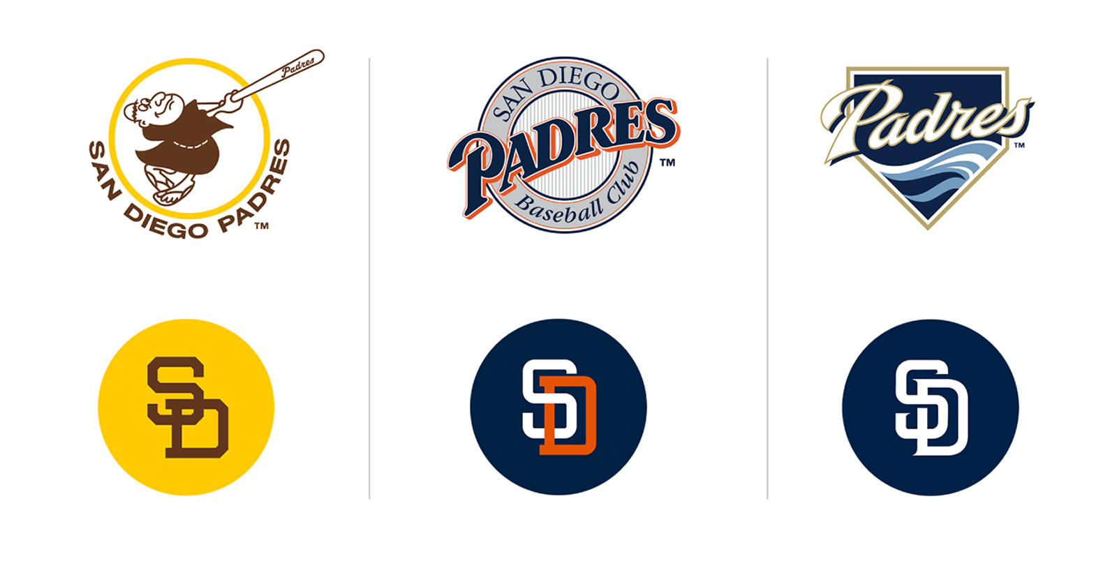

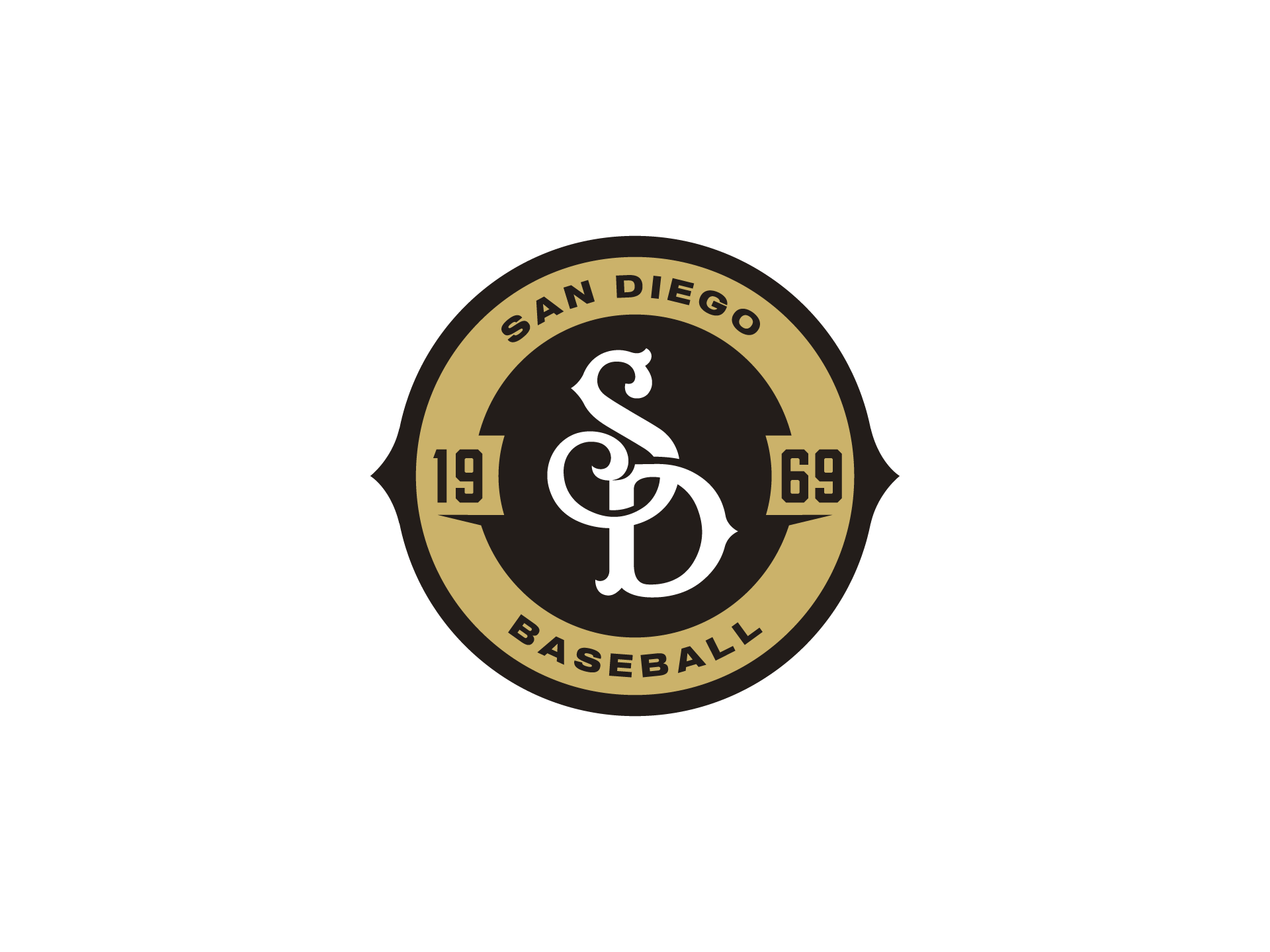

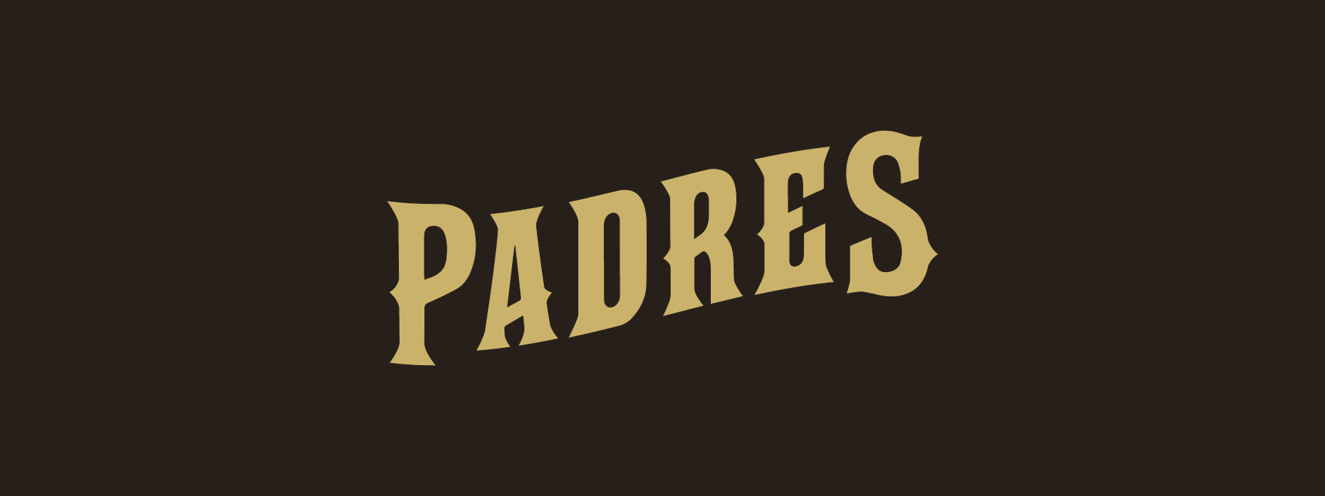
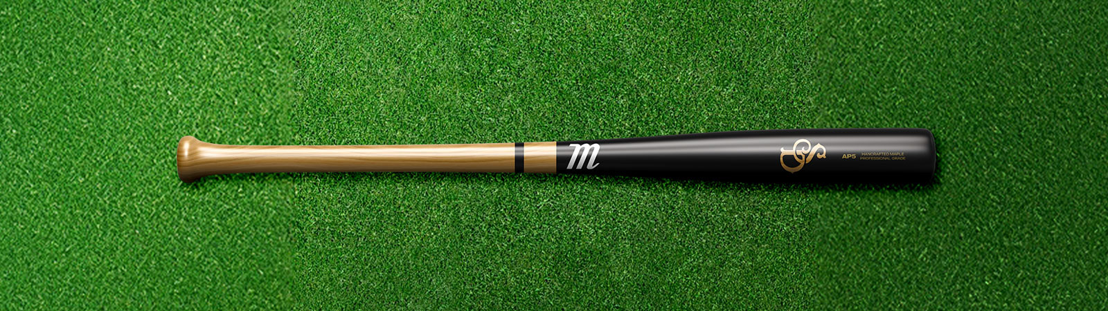
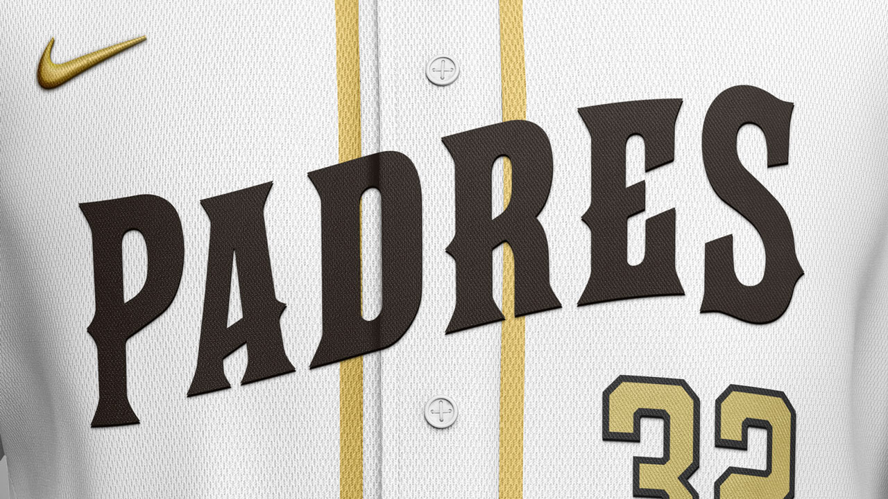
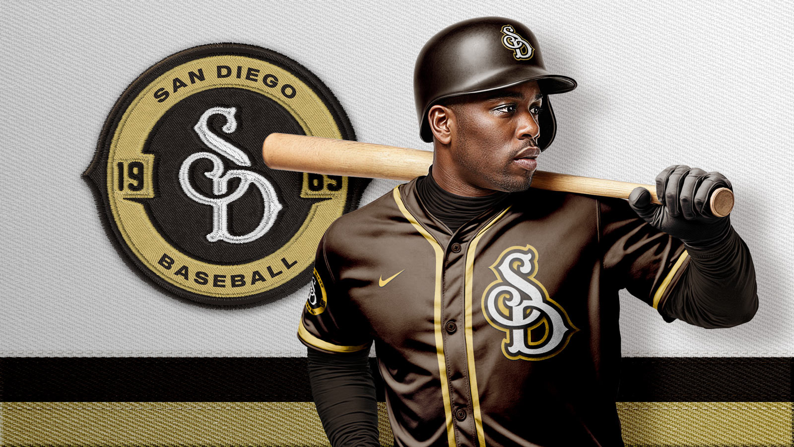
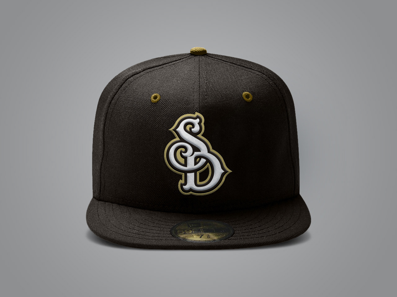
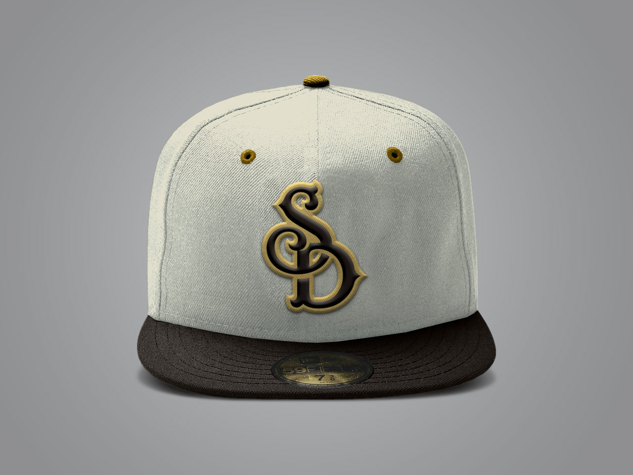
Back to Brown & Gold
We reimagined a concept rebrand for how the Padres could continue the path of professional, but tie back to their roots without looking like a “throwback” team.
The result is an evolved return to "brown & gold"–something a bit more grown up and "pro"–adding a taupe to provide warmth and flexibility.